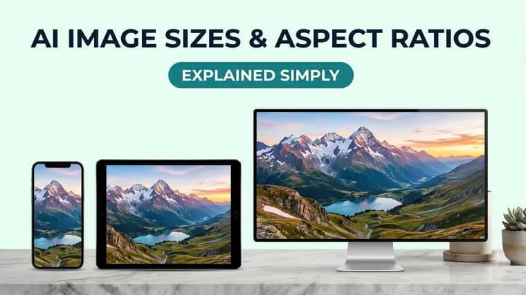
A great AI image in the wrong aspect ratio is a wasted generation. Instagram will crop it, YouTube will letterbox it, and a print shop will stretch it — and no amount of prompt craft fixes a composition that was framed for the wrong shape. This guide covers the five ratios that matter, where each one belongs, and how to actually get them out of the tools.
Why ratio comes before everything else
Aspect ratio is the shape of your canvas: the relationship between width and height. It determines where the model puts your subject, how much sky or floor it invents, and whether there is room for text. Because the model composes for the shape you give it, changing ratio after the fact means cropping — and cropping an AI image usually cuts through exactly the detail that made it good. Decide the destination first, then prompt. This is step one in our anatomy of a perfect AI image prompt, and it belongs at the end of nearly every prompt on our explore page.
The five ratios that cover almost everything
❖1:1 — square
The universal safe default. Square images display cleanly almost everywhere: Instagram feed, profile pictures, product listings, album-style grids. Because the frame has no long axis, compositions tend to be centered and symmetrical — great for portraits, product shots, and icons, less great for landscapes or anything that wants a sense of horizontal space.
Use it for: profile photos, product images, Instagram grid posts where you want a uniform look.
❖4:5 — vertical, Instagram feed
Instagram's tallest allowed feed format. A 4:5 image occupies noticeably more screen than a square as someone scrolls, which is why most polished Instagram content is posted at this ratio. It is only slightly taller than square, so compositions translate easily — but that extra height is real estate you should use, not waste.
Use it for: Instagram feed posts, Pinterest-style vertical content, portrait photography shared to social.
❖9:16 — full vertical
The full-phone-screen format: Instagram Stories and Reels, YouTube Shorts, TikTok, phone wallpapers. The frame is extremely tall and narrow, which is unforgiving for wide scenes — a landscape prompt at 9:16 gives you a sliver of scene and a lot of invented sky and foreground. It shines for single standing subjects, tall architecture, and wallpaper-style compositions.
Use it for: Stories, Reels, Shorts backgrounds, phone wallpapers.
Leave safe space
Stories and Reels overlay UI elements — username at the top, captions and buttons near the bottom. Keep faces and any text in the middle 60 percent of a 9:16 image, or the platform's own interface will sit on top of them.
❖16:9 — widescreen
The horizontal standard: YouTube thumbnails, presentation slides, blog headers, desktop wallpapers, video frames. YouTube thumbnails specifically are 16:9 (the platform recommends 1280 by 720 pixels as a minimum). Wide frames favor environments and cinematic compositions, and they give you natural side space for headline text — useful for thumbnails and hero banners.
Use it for: YouTube thumbnails, website heroes, slides, cinematic scenes.
❖3:2 — classic photo and print
The traditional 35mm photography ratio, and the shape of standard photo prints (a 6x4 print is exactly 3:2). It reads as "photograph" in a way that 16:9 reads as "film still." If your image is destined for printing at common photo sizes, generating at 3:2 (or its vertical twin, 2:3) avoids a crop at the print shop. Larger poster sizes vary — 18x24 inches is 3:4, A-series paper is roughly 1:1.41 — so check the target size before generating.
Use it for: prints, framed photos, photography-style images, some poster sizes.
How to request ratios in prompts
Tools differ, and this is where people get tripped up.
- ChatGPT: state the ratio in plain language at the end of the prompt — "16:9 aspect ratio" or "vertical 9:16 format." It supports square, wide, and tall outputs and respects the request reliably.
- Gemini: same approach — ask in natural language ("generate this in 9:16 portrait orientation"). When editing an uploaded photo, Gemini usually keeps the photo's original ratio, so crop your source image to the target shape before uploading.
- Midjourney: uses an explicit parameter written as "--ar 16:9" at the end of the prompt, and accepts nearly any ratio.
- Grok and Qwen Image: offer ratio or size options in the interface, plus natural-language requests in the prompt.
Whatever the tool, put the ratio request at the end of the prompt and keep it unambiguous. Saying "vertical" alone is vague — is that 4:5 or 9:16? Name the numbers.
Cozy reading nook by a rain-streaked window, warm lamp glow, a sleeping cat on a knitted blanket, stack of well-worn books, soft film photography look with gentle grain, muted amber and slate-blue palette, composition leaves the upper third open for title text, vertical 4:5 aspect ratio.
Guide the frame
If a tool ignores your ratio request, reinforce it through composition language: "tall vertical composition, full-body subject, floor to ceiling" pushes toward portrait framing even when the ratio instruction alone is not enough.
Common cropping pitfalls
❖Generating square, cropping later
The most common mistake. A centered square portrait cropped to 9:16 either cuts the head or leaves dead space; cropped to 16:9 it loses the top and bottom entirely. Generate at the destination ratio so the model composes for it.
❖One image for every platform
A single image rarely survives feed, story, and thumbnail duty. If a campaign needs all three, generate three versions of the same prompt at 4:5, 9:16, and 16:9 — the model will recompose the scene appropriately each time. Keeping the rest of the prompt identical keeps the set looking related. Our guide on how to use prompts from PromptMatrix covers adapting one saved prompt across formats.
❖Edges you cannot trust
AI models sometimes place important detail near the frame edge, and platforms sometimes shave edges during display (feed previews, rounded corners, TV overscan on some displays). Prompt for breathing room: "subject centered with generous margin" costs nothing and survives every platform's handling.
❖Upscaling instead of regenerating
Cropping a small region out of a large image and enlarging it produces soft, muddy results. If you want a tighter framing, re-prompt for it — "close-up, head and shoulders" — rather than cropping into a wide shot.
One image, three crops
A bakery owner wants one hero image everywhere. Instead of cropping one generation, they run the same prompt three times: "overhead flat lay of fresh croissants on a marble counter, morning window light, steam rising from a coffee cup" — at 4:5 for the Instagram feed, 9:16 with "vertical composition, coffee cup at the bottom" for Stories, and 16:9 with "wide counter scene, space on the right for text" for the website banner.
For more on structuring the rest of the prompt around your chosen frame, see how to write better AI image prompts.
Frequently Asked Questions
❖What aspect ratio should I use for Instagram in 2026?
4:5 for feed posts (it takes up the most scroll space), 9:16 for Stories and Reels, and 1:1 if you want a perfectly uniform grid. Avoid posting 16:9 to the feed — it displays small and gets cropped in grid view.
❖What size should a YouTube thumbnail be?
16:9, ideally 1280 by 720 pixels or larger. Generate at 16:9 directly and leave clear space for bold title text, since thumbnails are usually viewed at very small sizes.
❖Can I change the aspect ratio of an image I already generated?
Only by cropping (losing content) or outpainting (asking a tool to extend the scene beyond its edges, which some editors support). Regenerating at the correct ratio almost always gives a better composition than either.
❖Do aspect ratios affect image quality?
Not quality directly, but extreme ratios can hurt coherence — very tall or very wide frames give the model a lot of empty canvas to fill, which is where repeated patterns and odd artifacts tend to appear. Stick to the standard ratios unless you have a specific reason not to.